Saturday, July 30, 2011

Design Therapy through {Grey}

Grey is versatile, sophisticated,subtle.... I like grey, it just makes me realize how a world is neither back nor white. 
While using grey in interiors, you need to be very careful as dark grey might make the room look dull and gloomy,or a light shade might just appear dirty. Choosing the right shade is very important.

Go try some grey in your design.


Saturday, July 23, 2011

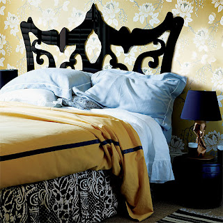
Design Therapy through {Yellow}

I admit yellow is the hardest color to work with as it is psychologically tricky and sometimes comes out to be too bright... but if you get the right shade, it can do wonders for your home. 

Yellow can sometimes be disturbing and can cause turmoil, but on the contrary it's hues give a vibrant and bright feel to your home.  


Colors that go well with yellow - white, grey, brown, black. 
let me show you how... 


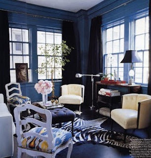
Design Therapy through {Blue}


The color blue besides being my favorite color happens to be very soothing, relaxing and cool as a color.It is refreshing to the eye and sends across a sense of tranquility.  

Using blue in interiors has a very calming effect in the atmosphere. The blue skies and oceans relaxes a person down and thus can have the same effect when used in homes, offices etc.

Some Colors that go well with blue - white, golden, yellow, cream.

Today's color focus is navy blue. 


Color and Hue!!!

 The next series of posts are based on colors and hues... The theme struck me after actually having to decide what color to choose while re-painting my room. 
It was difficult but very calming after it was done... so here are some of my views on colors and their applications  to brighten up your home interiors.
Hope you will enjoy it!!! 


Wednesday, July 20, 2011

Having fun with outdoor furniture.

Outdoor Furniture can sometimes be very boring and dull, but with the options in the market that will not be a problem anymore. Check some of the funky designs below.